
Fine Print
Fine Print: A Review of the Arts of the Book was a quarterly journal published from 1975-1990. Each issue featured a cover designed by a different book artist (typographer, calligrapher, printer, etc.).
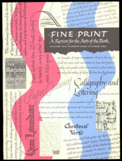 |
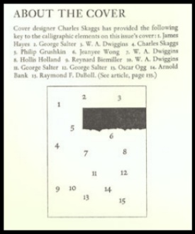
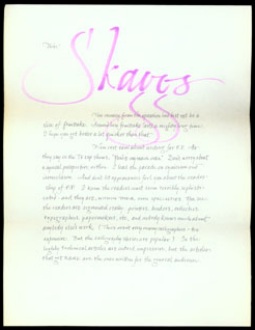
ōAmerican Calligraphy Revisted 1945-1965öCharles E. Skaggsin Fine Print, Volume 10, number 4, October 1984 This issue featured a cover by Charles E. Skaggs, a composite of lettering by a number of American calligraphers; a key to the identity of the various hands is shown below. |
| Skaggs also wrote an article in this issue surveying a fruitful twenty years of American calligraphy. He begins by lamenting the present scarcity of calligraphy in trade publishing or business, other than greeting cards. He discusses earlier periods which were more favorable to aspiring calligraphic designers, starting with Edward Johnston in England in the early decades of the twentieth century: ōEdward Johnston and his disciples set in motion a renaissance of lettering and writing in England.ö JohnstonÆs example extended to the United States. From the mid-1930s a small group of ōpioneersö from various geographical and cultural backgrounds generated changes in publication design. All shared a re-emerging historical interest in the alphabet and ōlaid the groundwork for an outburst of calligraphic expression in book work.ö Skaggs discusses book design and book jackets, and ends with brief profiles of seven men ōprimarily designers and secondarily calligraphers, whose collective legacy is paramountö to the distinguished heritage of American calligraphy. These biographies, as well as other comments by Skaggs from this Fine Print article, appear in the text of some of the labels throughout this exhibition. |
|
Responses To Charles Skaggs' 1984 Fine Print Article:
With the cover Charles Skaggs designed for Fine Print are letters from other calligraphers about his article, written in a variety of beautiful hands.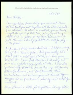 |
 |
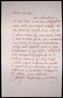
Phillip GrushkinAutograph letter. November 4, 1984Philip Grushkin (born 1921) was, according to Skaggs, ōthe brightest and youngest of the feisty kids of the 1940s.ö He trained with George Salter and soon developed his own less academic styles of italic and pen-constructed capitals. ōFor more than a dozen years his jackets exemplified the sophisticated New York look that publishers were eager to adopt.ö In this letter, Grushkin congratulates Skaggs for ōa splendid bit of writing, and particularly for including me in it.ö |
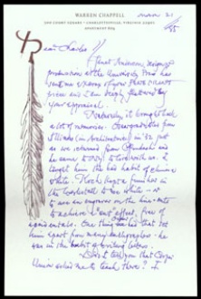
Warren ChappellAutograph letter. March 21, 1985Type designer and author Warren Chappell (born 1904) ōhas done probably more illustration and book typography than calligraphy. However, his early grounding in traditional letterforms is as evident in his typeface designs as in his facility with a pen in illustration and ornament.ö His letter to Skaggs is ornamented with a drawing of a quill pen. |
 |
 |
Don M. MoyAutograph letter. December 28, 1983Don Moy was a contributing editor at Fine Print. In this letter predating SkaggsÆ article, Moy reassures Skaggs about it: ōNow rest easy about writing for F.P.ö |
Lili WronkerAutograph letter. [p.m.] December 18, 1984 Lili Wronker is an accomplished calligrapher, in both the English and Hebrew alphabets, and is also a childrenÆs book illustrator. |
Return to Skaggs Exhibition home | Next Case: The Limited Editions Club
