Holotutor Prototype

Introduction
Students: Ashley Ng, Sula Demers, Yuhan Wen
Our design prompt was to find and design for someone who lives a double life. We interviewed a student, Catherine, and made an individualized system to help her balance between STEM and History, the two main components of her double life. Our design is an app that uses holographic technology to help her with the schedule, remind her of events, and avoid distraction from her phone. We followed the procedure of empathizing, defining, ideating, prototyping, and testing to get to the final design. In this portfolio, we show our user’s story as well as our own with the design through four perspectives.
Human-Centered
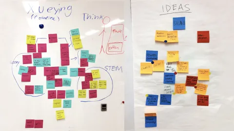
After interviewing our user, we learned that she mainly struggles with procrastination and balance in her double life. During the semester, she takes an equal amount of STEM and History classes, however, her real passion lies in History with a particular interest in Modern China. She strives to learn more about her own country’s history and not be hindered by the censorship she faces at home. Her intentions in taking STEM classes are mainly influenced by her mother who is thinking of her future and the job opportunities that come with it. Catherine is taking STEM classes as a necessity and not through personal interest. She admits that there is an attitude shift when she is learning about history and when she is learning about math/science. While she sits at the front of her history class, she is usually late to her STEM classes. Through the use of empathy mapping we noticed that a lot of her choices in life is influenced by her parents. Her father plays a major role in her interest of History and her mother encourages her to take STEM classes for the sake of her future. We realized that we cannot come up with a solution for her conflict between the two academic subjects because in the end she is the one who will decide what path she will take. What we needed to design for our user was something that will help her balance the two lives.
The first time around, our team struggled a bit with this process as we left out the technology review during our first interview with Catherine. Luckily we were able to meet with her again on short notice and during our second conversation with her we found out that she relies on three types of technology that helps her balance her schedule: coffee, her laptop and her note-taking strategy. From this information we generated ideas for our user such as a personalized coffee mug, an app that can help her stay on task and a binder that combines note taking and AI technology that reminds her of homework/to-do lists. In the next section we explain the evolution of our design and how we worked towards our final prototype.
Experimental
Mapping Our User and Brainstorming
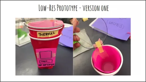
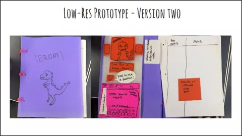
Through the the design process, the team’s design went through five physical prototypes. Each prototype had unique features that helped map out our thinking as we designed. Our first two low resolution prototypes were made simultaneously based on the tools our user had described helping her in everyday life; coffee, and a notebook/binder to do work in. We decided not to focus on her laptop as a tool, because there are already features available on laptops that are set to keep people on task. We did not want our project to be redundant.
Low-Res Prototypes
Meta-Cognitive
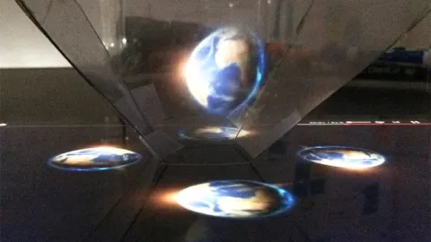
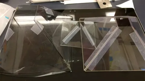
After creating these prototypes we decided to leave the mug as well as binder concept and only keep the AI technology part of the design. As part of an empathy mapping brainstorm, we generated some crazy ideas such as; creating a robot personal trainer/tutor, cloning the user to take STEM classes for her, and making full size historical holograms to motivate our user to study. With a little research on the internet we learned that with a simple translucent material, such as a CD case, holograms can actually be made (Image above). It’s surprising that our crazy ideas led directly to our final app design that incorporates holographic technology. Below are final designs of how the app would look on a typical phone screen.


Feedback From Our User
Our user Catherine liked our idea of a holographic tutor and said that she’d love to actually use it to help her with the homework and scheduling. Since the hologram functions with her phone on top of the acrylic pyramid, the user can’t use her phone while playing the hologram, avoiding distraction from the phone. To go further with that point, Catherine suggested we add another feature that blocks the messages from her social media when the program is active. Also, to see the hologram clearly, the user has to keep her eyes the same level as it, which is inconvenient because of how small the hologram is. To fix this problem, we would have to make the projector taller and adjustable so that the user can keep it at eye level, instead of having to bend down to see it.
Collaboration
As a team, we all contributed and voiced our thoughts, perspectives, ideas, and worked to fit all those ideas together. We worked as one in many aspects of the project, but at the same time, we contributed our individual strengths in order to maximize the productivity of the team. Ashley did a wonderful job sketching and visualizing our design of the app. After brainstorming, she also compiled our ideas into one streamlined form and designed a unitive style. Sula is the best writer among us. In this project, she was very helpful in organizing words, drafting the slideshow and portfolio, and delivering our ideas in other words for better understanding. Wen was in charge of 3D design. She made sure our ideas were plausible, did research to find the best way to make an idea come to life, and was the one to construct our holographic model. Overall, our team worked well because everyone had plenty of ideas to share and were happy to contribute them to the team. We compensated for each other’s weaknesses and made good use of our individual strengths to provide a solid design.
Reflection
In retrospect, we never had a completely clear idea of what we wanted to make and how to do so. All of our prototypes were very different in design and use, but it was the common elements that stuck with us and became our app. As a team, we knew when to step away from an idea that was not working, and instead of forcing that idea to work, we found we could take a new angle and start fresh. As we worked on the project for our user we also made it for ourselves, as students it’s easy to empathize. That feeling that we could combine the needs of our user with our own dreams and wants is really satisfying. We made mistakes as a team, but each of those mistakes led to a better understanding of design thinking, and to more ideas we had not considered when designing.