
Lettering Models: Oscar Ogg, 1908-1971
"Probably more than any other designer between 1939 and 1950, Oscar Ogg made book buyers aware of calligraphic jackets. No one before or since has written with more dashing facility … In one decade (before joining Book of the Month Club as executive art director) he produced writing and jackets of such volume and distinction as to be the envy of most other calligraphers. On Oscar’s jackets, the calligraphy was dominant. Like it or not, his work was the standard against which many others were compared ... The integrity of letterforms was rarely if every compromised. Ogg’s early excess of flamboyant ascenders and descending loops was later moderated by maturity and less need to proclaim his dramatic penwork. Publishers used his designs mostly for anticipated bestsellers or well-established reprints … His jackets were simply handsome little posters, with a clear and stylish statement of title and author."
--Charles Skaggs
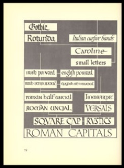 |
An Alphabet Source BookOscar OggNew York and London: Harper & Brothers, 1940 The paper label on the slipcase for this book describes it as “a copybook of lettering styles offered for inspiration, for study and for practical use.” The volume also includes a thorough history of the development of letterforms. |
Lettering of Today
Edited by Charles Geoffrey HolmeLondon and New York: The Studio, 1937
Charles Skaggs signed his name and the date of acquisition in many of
his books. This book is dated 1938; Skaggs obtained many works on the
book arts, which are now considered collectable, when they were originally
issued. This book includes sections on “Calligraphy,” “Lettering in Book
Production,” “Lettering in association with Architecture,” and “Lettering
in Advertising.” In this last section, author R. Haughton James suggests
that “lettering should be confined to what type can’t do … Copying type
is absurd; the letterer is free.” He further states that “lettering is
best used as a foil to type. One touch of script can add distinction to
an otherwise dull advertisement.” This advice certainly was taken to heart
by the many book jacket designers in the 1930s through 1950s, when lettering
was used to great advantage, both alone and in combination with printed
types.
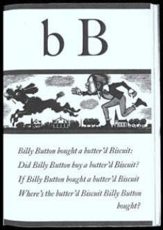
Peter Piper's Practical Principles of Plain & Perfect PronunciationBrooklyn, New York: Mergenthaler Linotype Company, 1936This book, intended as an advertisement for the many typefaces available from the Mergenthaler Linotype Company, features rhymes based on the nineteenth-century tongue-twister which begins “Peter Piper picked a peck of pickled peppers.” Each page was designed by a different notable twentieth-century book or type designer and/or illustrator. This page, for the letter B, was designed by Joseph Blumenthal (born 1897), proprietor of the Spiral Press in New York City, and a designer of several typefaces. |
 |
Return to Skaggs Exhibition home | Next Case: Designs 1949-1960
